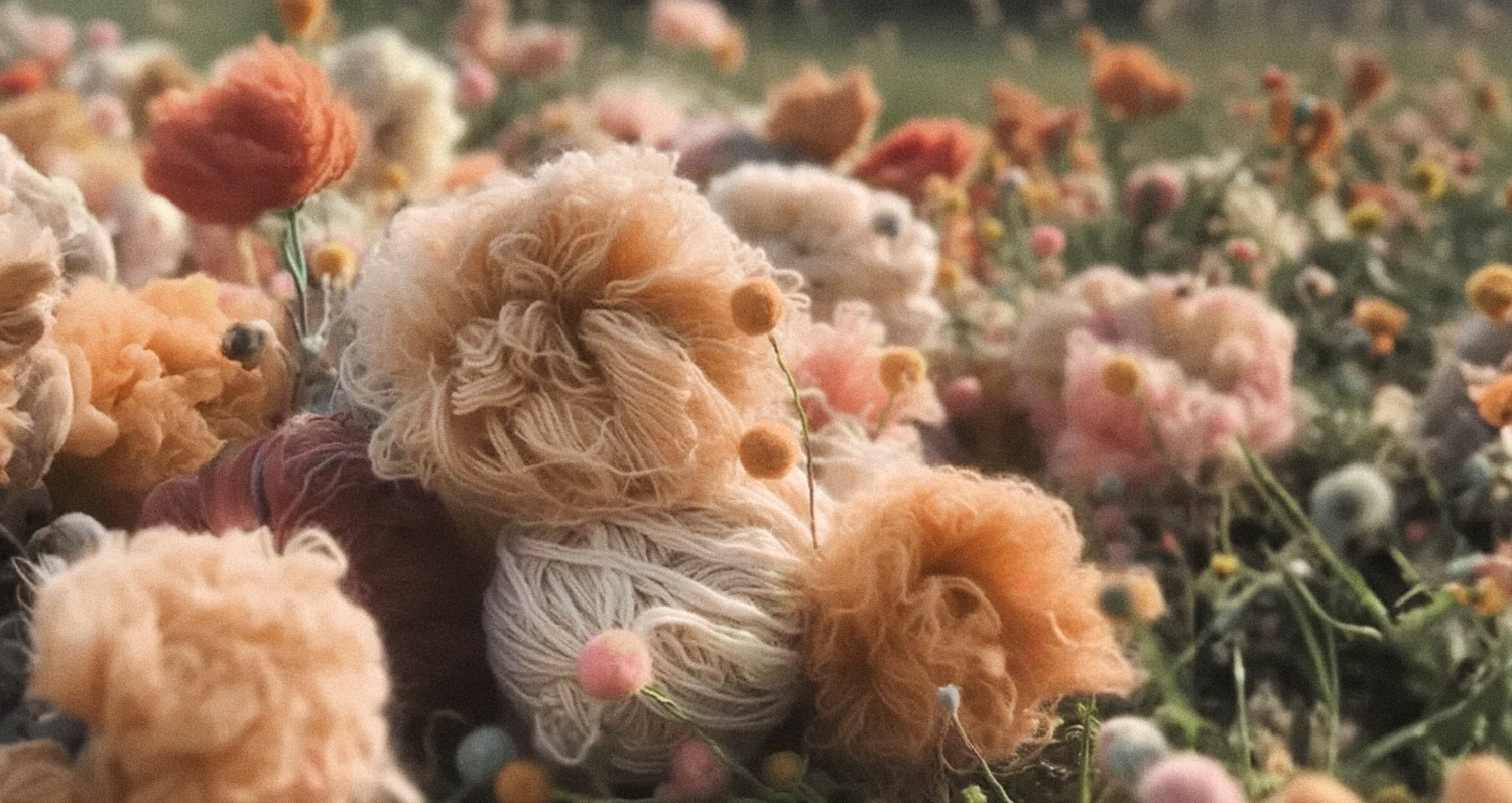
The Peachy Shade We've All Been Waiting For...
So, PANTONE has just announced the Color of the Year for 2024! (I've shared a big collection of interiors featuring this shade at the end of the post). For those who might not know what this is all about, PANTONE is an organization that has been the global authority on colors for many years, studying and working with various shades (since there are only seven basic colors, but hundreds and hundreds of shades). With their extensive experience and research, they’ve earned the right to predict color trends for the upcoming year—or even create them. That's a quick overview of what PANTONE does.
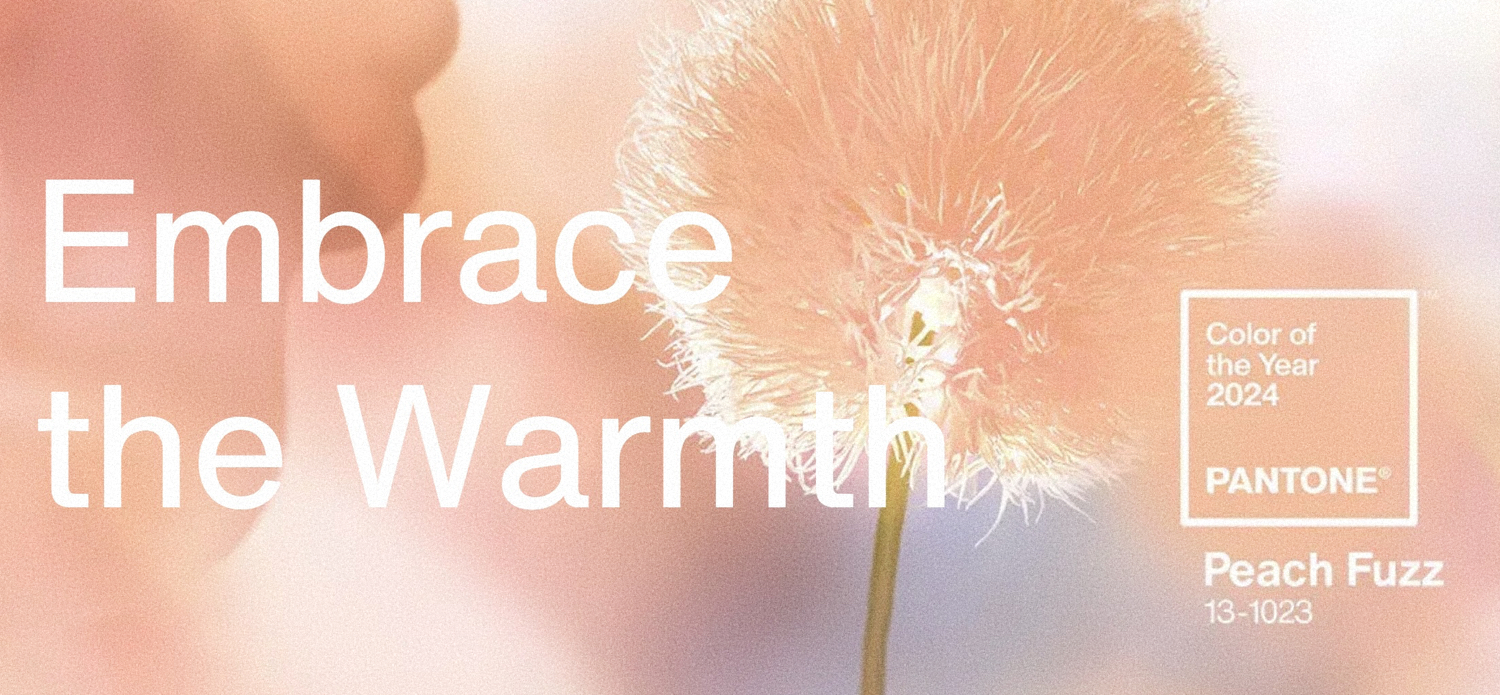
To be honest, I haven’t expected much from these “Color of the Year” announcements for a while now. Something that’s actually usable in interiors without earning the “Cringe of the Year” award, anyway. If you check out PANTONE’s picks from the past few years, you’ll see exactly what I mean.
But voilà! The Color of the Year for 2024 is called Peach Fuzz—how adorable is that? Now, I’m not usually one for cutesy interiors, but this shade is genuinely soft, uplifting, floral, and even a bit woolly. And it's visually so warm!
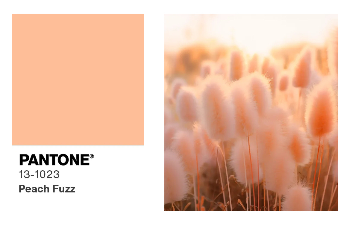
A typical peach shade has a pinkish undertone, but this one leans more towards orange. And that’s pretty amazing because pink tones rarely work well in more mature interiors, whereas this shade is closer to terracotta or clay ceramics. The key to making it work in almost any space is not to go too bright or intense. But here’s the most interesting part… you won’t believe it… this shade has actually been a TOP TREND in interiors for a few years now. So, in a way, PANTONE has highlighted a very obvious and beloved shade, signaling that peachy interiors have moved beyond being just a trend—they’re now more of a timeless style.
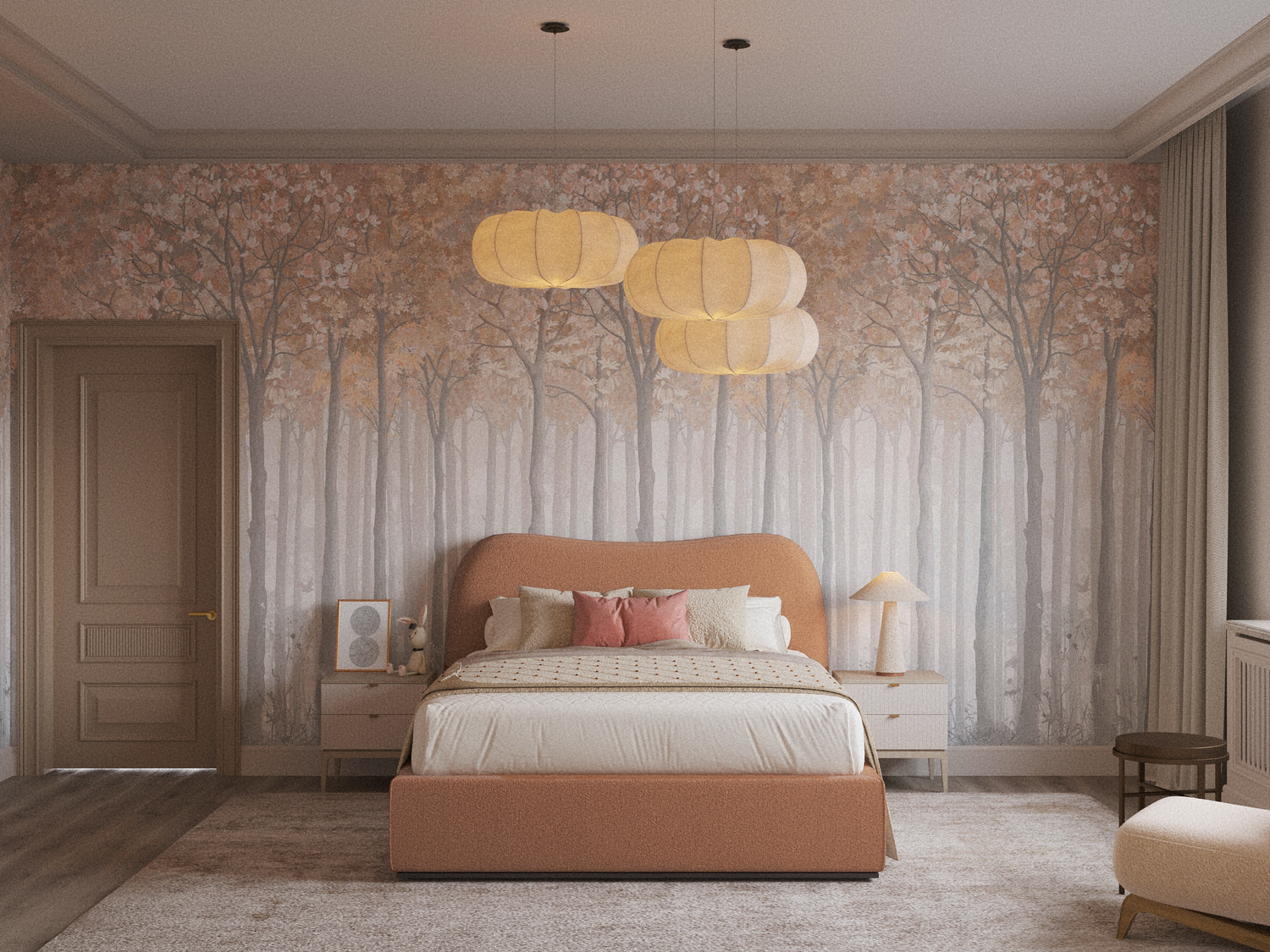
PANTONE doesn’t create these colors specifically for interiors. This shade is meant to influence all creative fields (advertising, fashion, graphic design, etc.). But since I’m an interior designer, I’m going to focus on how to use it in spaces.
I’ve actually been using it for quite a while now, and when I need to design a girl’s bedroom, for example, I’d choose this peachy shade with an orange base over its pink counterpart.
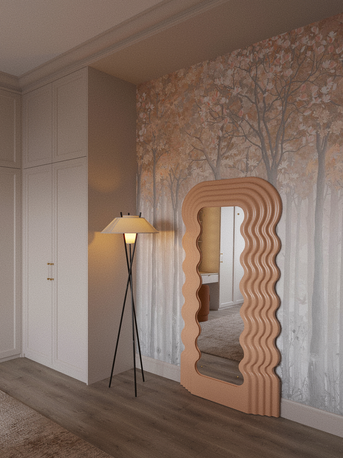
I wouldn’t recommend using it excessively in interiors, as it’s quite bold. But if you tone it down, it becomes one of the best shades for a space—think almond. I’ve put together a large Pinterest collection of genuinely stylish interiors in “Peach Fuzz” for you. So you can see how it looks in different spaces.
CLICK HERE TO VIEW THE PEACHY INTERIOR COLLECTION